branding design surftides, lincoln city
CHALLENGE
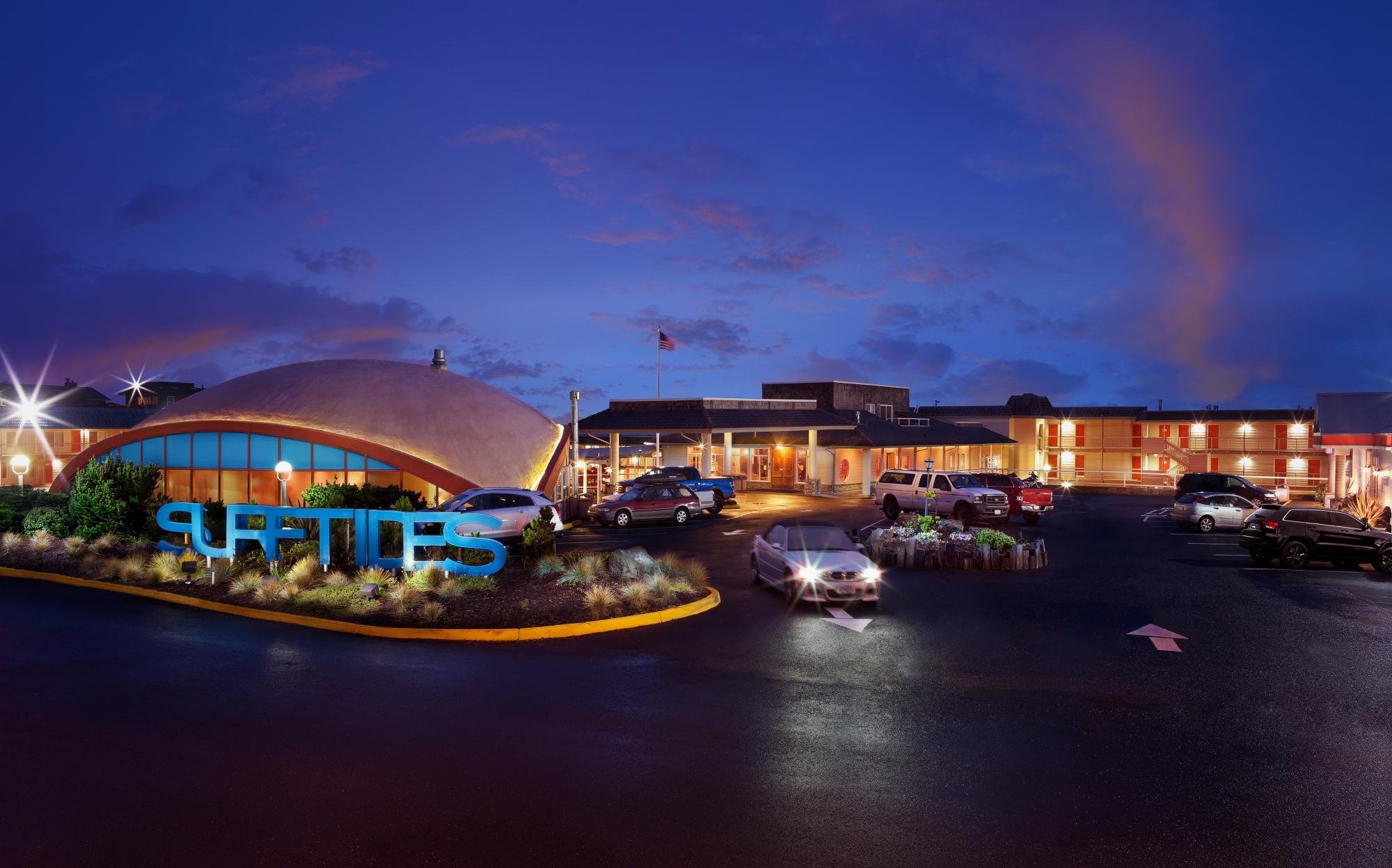
Surftides was in need of a branding facelift to carry on a consistent branding voice among Farmer's Daughter Hotel Group.
SOLUTION
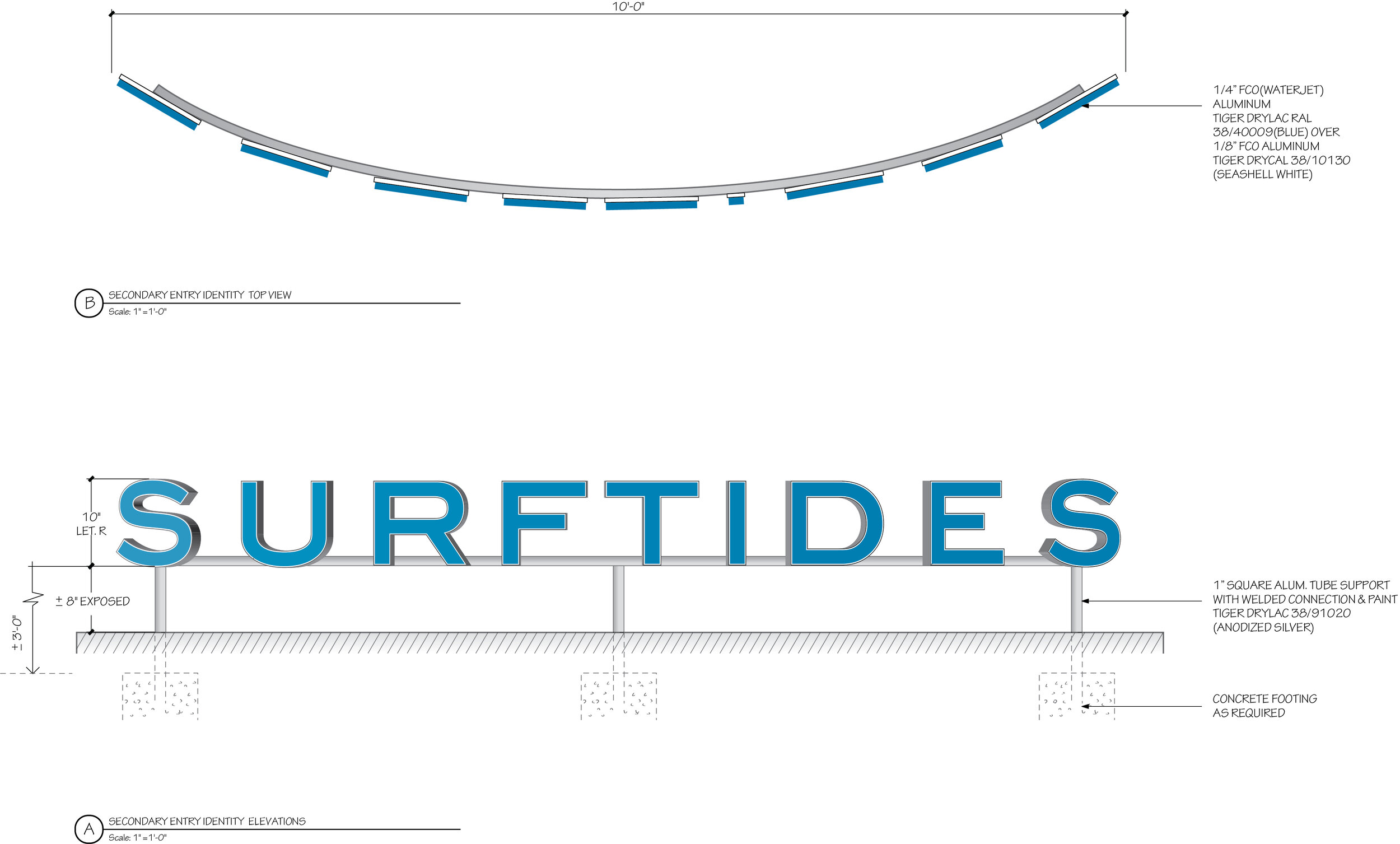
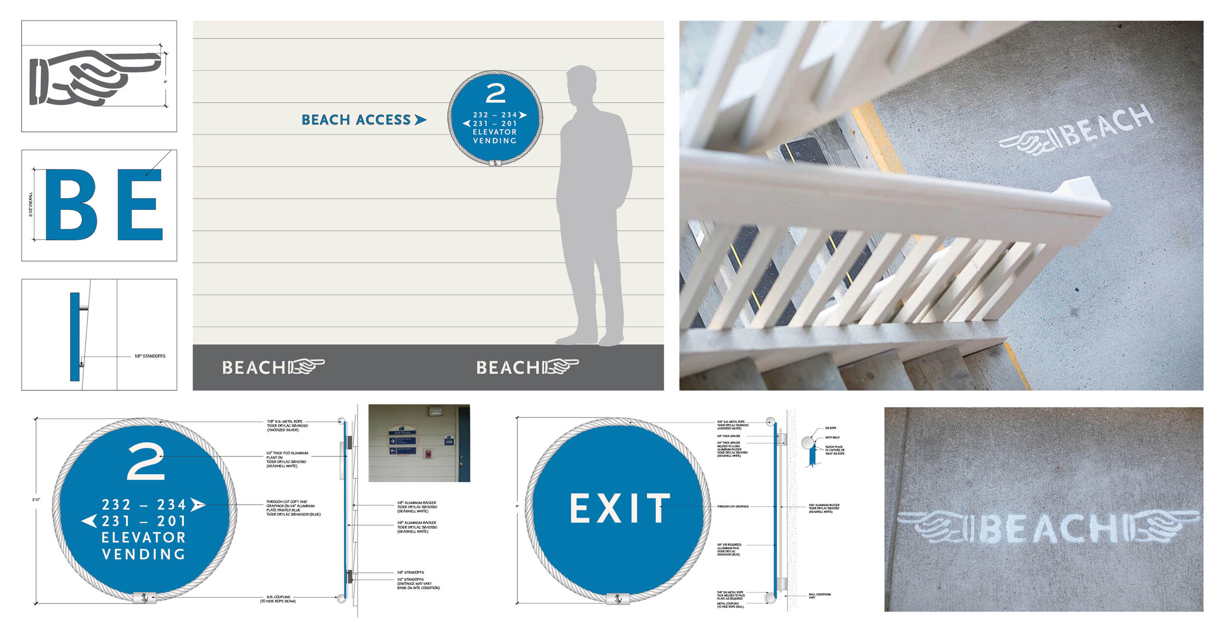
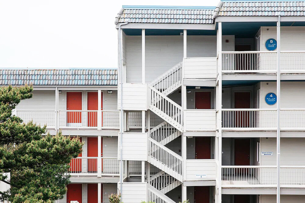
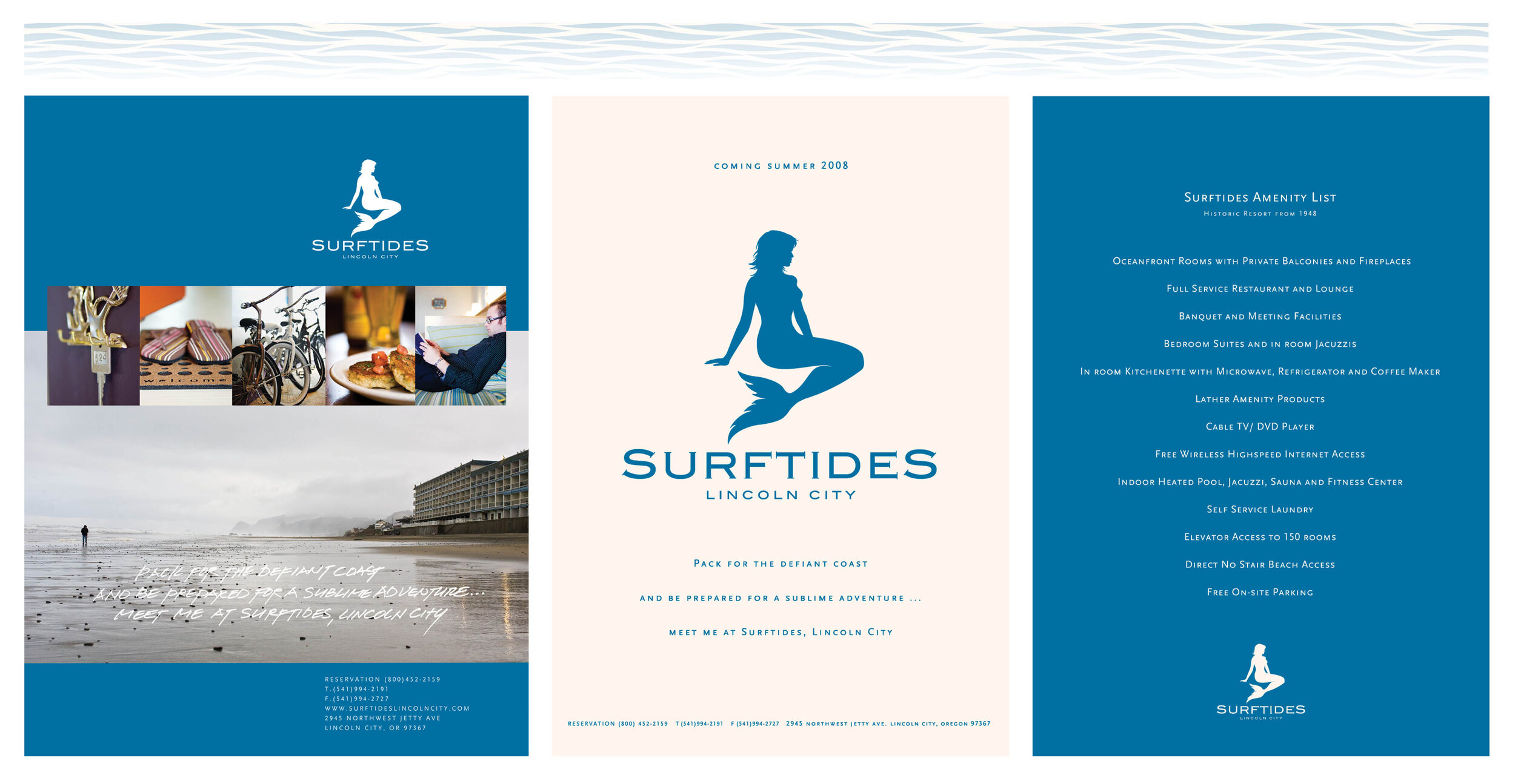
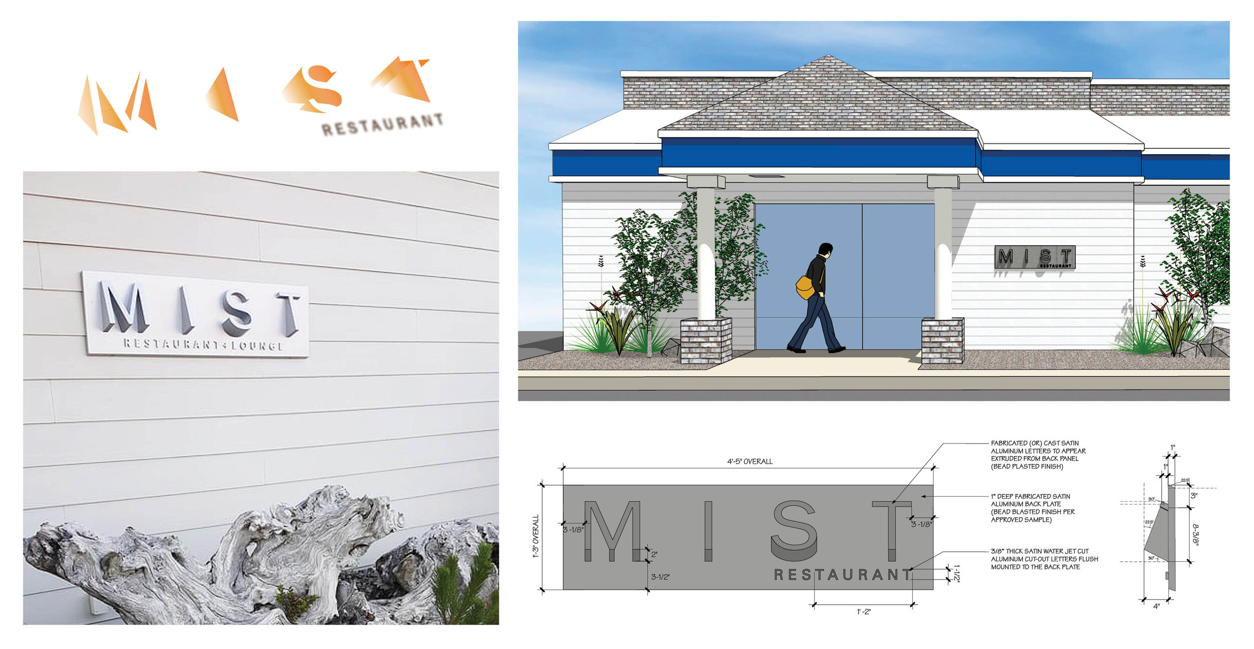
Usage of bright colors, sailor ropes, the concept of beach sunset, and footprint to communicate the new brand voice of modern, unique, hip, and fun. I was in charge of the exterior and interior signage design, advertisements, stationery, billboards, merchandise, and collateral products for Surftides Lincoln City; logo development, restaurant signages, and advertisements for Mist Restaurant.
project scope
branding design / wayfinding design / environmental graphic design / marketing collaterals
my role
design lead