PACKAGING CONCEPT DESIGN UNISOM SLEEP TABS
challenge
“Out of the box” brand and packaging exploration for pharmaceutical brand, Unisom.
solution
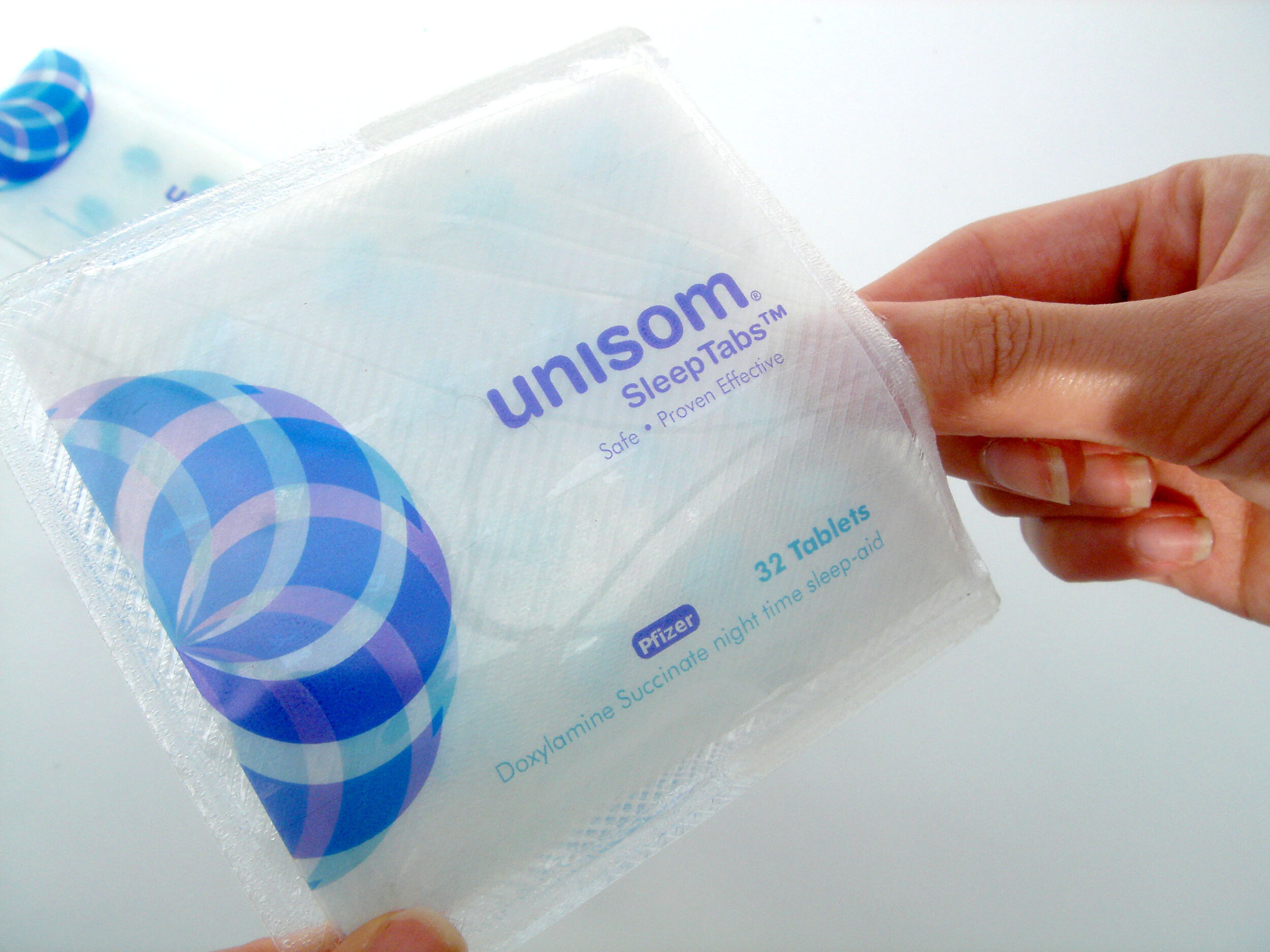
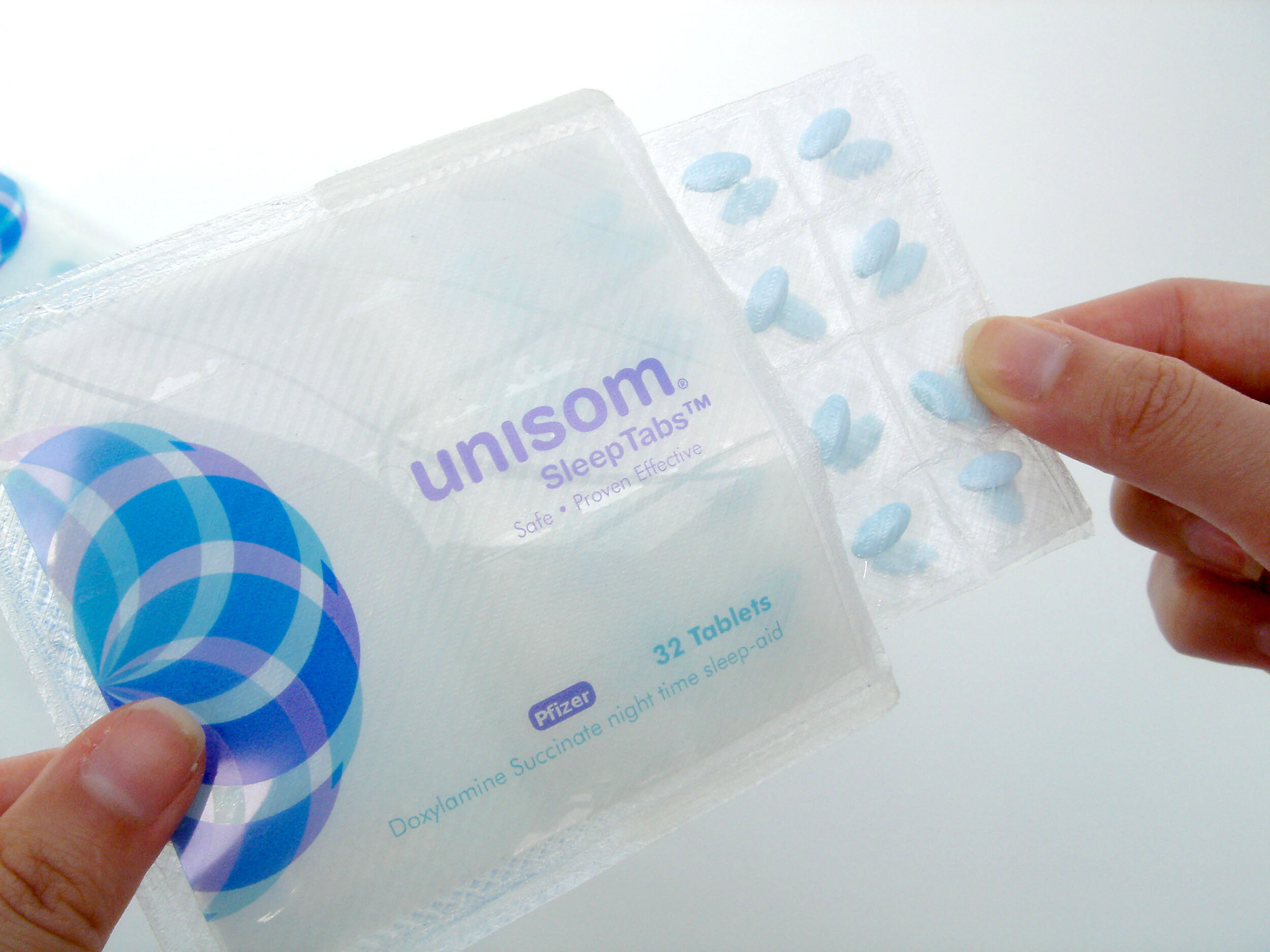
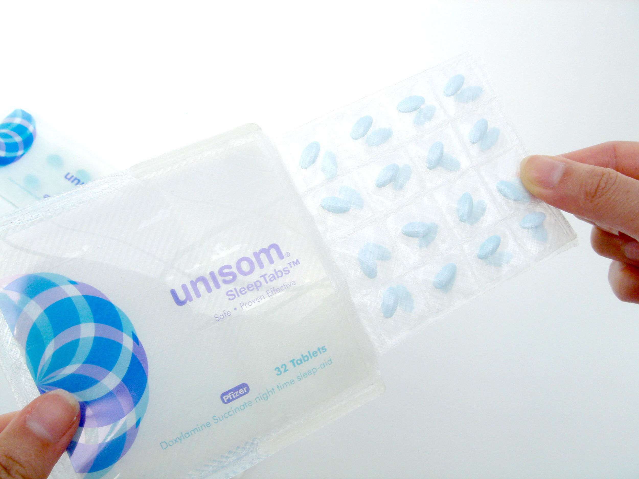
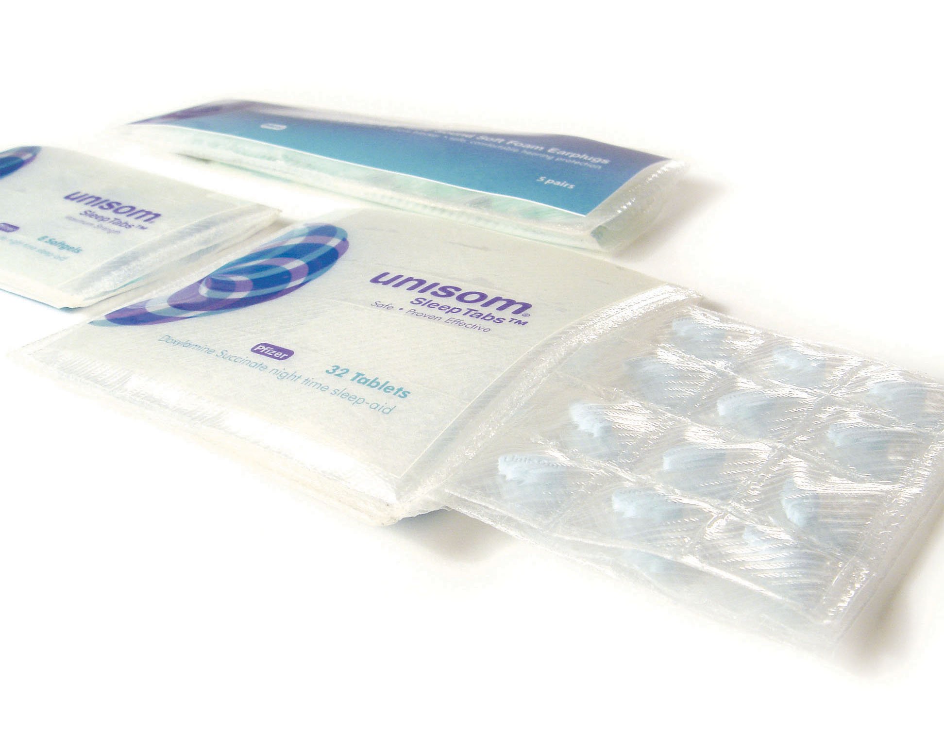
Redesigned branding from logo to packaging form to reflect product function principle. The Unisom brand is widely known for its sleep-aid pill. The logo mark symbolizes hypnosis while suggesting the ideas of subconsciousness, soothing, depth, and effectiveness. Color usage of blue and purple implying comfort and soothing esthetic. The use of a pillowcase package form enhances the brand, while securely cradling the pills inside to convey trustworthiness and safety.
project SCOPE
logo design / packaging design / branding design
my role
designer
